Have you ever picked up a book that instantly felt comfortable to read? The margins were just right, the text flowed smoothly from page to page, and every chapter seemed perfectly placed. That feeling does not happen by chance. It is the result of careful interior formatting for paperback books. For many new authors, formatting might feel like the least exciting step in publishing. You have poured your heart into writing your story, and now the technical side can seem intimidating. Yet, this stage is where your words truly come to life on paper. Interior formatting is what turns a manuscript into a professional-looking paperback that readers can enjoy effortlessly. Imagine your book as a beautiful house.
The writing is the structure, the story is the design, but the formatting is the interior arrangement that makes everything work together. It decides how your readers experience your book visually and emotionally. Every element, from font size to spacing, contributes to the overall comfort of reading. Whether you are working with book publishers, an ebook publisher, or planning to self publish, understanding this process is essential. Great formatting makes your book feel polished and trustworthy. It can be the difference between a reader finishing your story or setting it aside after a few pages. This guide will walk through the essential steps and creative touches that make interior formatting a smooth and rewarding part of your publishing journey.
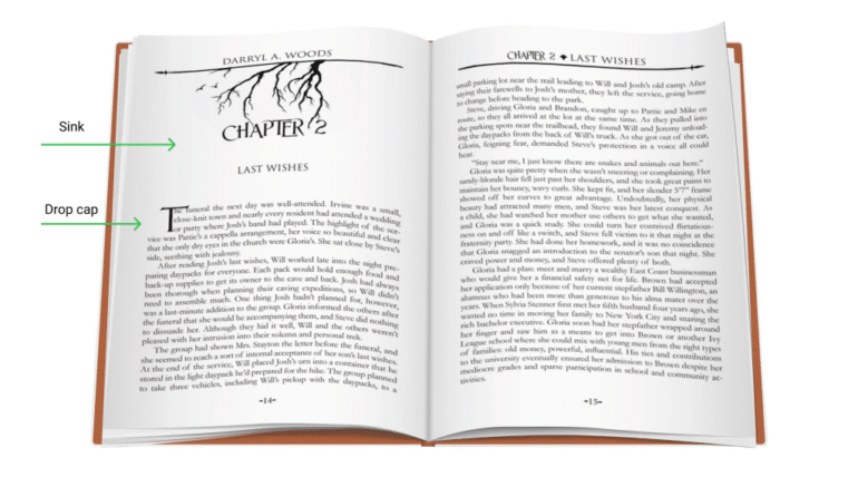
Understanding the Purpose of Interior Formatting for Paperback Books
Interior formatting for paperback books involves balancing aesthetics and readability, allowing readers to focus on the story rather than the structure. Proper formatting ensures uniformity throughout the manuscript, with consistent chapter headings, aligned paragraphs, and balanced margins. Small details like line spacing, text alignment, and font choice impact the professional appearance of the book. Clean formatting signals the author’s value to readers. Working with an ebook publisher requires extra attention to precision, as paperback formatting is fixed and what is seen is what readers will receive, requiring extra attention to detail.
Choosing the Right Trim Size and Layout
Interior formatting for paperback books: The trim size determines the overall dimensions of your paperback. Common sizes include 5 x 8 or 6 x 9 inches. The right size depends on your genre, audience, and preference. A romance novel might look elegant in a smaller trim, while a non-fiction book often feels better in a larger one for easier reference. Once you decide on the size, layout choices follow. Standard margins allow space for binding and comfortable reading. Left alignment is usually preferred, and indentation or spacing between paragraphs should remain consistent. Avoid crowding your text or leaving too much white space, as both can distract readers. Page numbers, headers, and footers also play a role in professionalism. Adding your book title or chapter name at the top of each page can help guide readers through the story.
Typography That Speaks Your Style
Fonts are the voice of your book’s visual personality. Serif fonts like Garamond or Times New Roman are reader friendly and common in fiction. Sans serif fonts are often used for headings or modern genres. Keep your choices minimal, one for body text and one for headings is enough. Font size usually falls between 10 and 12 points for comfortable reading. Pay attention to line spacing too, as tight spacing can feel cramped while too much spacing looks unpolished. If you plan to include Book Illustration, formatting becomes even more critical. Text and images should align naturally so illustrations support the story without breaking the flow.
Managing Front Matter and Back Matter
Your front matter includes everything that appears before the main story title page, copyright, dedication, and table of contents. The back matter includes the author section, acknowledgments, or a teaser for your next book. Each section should start on a fresh page. The title page is usually centered, while the copyright and dedication pages follow with clean spacing. Consistent formatting across these pages creates a smooth reading experience. For authors who say, “I am ready to publish my book,” this stage shows how serious you are about presentation. Book publishers often check these sections first to assess your professionalism.
Balancing Aesthetics with Readability
A beautifully formatted book is one that readers can lose themselves in without noticing the design. This happens when text placement, spacing, and layout complement the story rather than distract from it. Widows and orphans (single lines left at the top or bottom of a page) should be avoided. Proper alignment, justified text, and thoughtful chapter breaks maintain visual balance. Add subtle decorative elements only when they enhance the theme, not when they draw attention away from the narrative. If your book includes illustrations, charts, or graphics, integrate them seamlessly into the design. Each element should look like it belongs there, not just added as an afterthought.
Bringing It All Together with Interior Formatting for Paperback Books
Interior formatting for paperback books involves blending creativity with precision, creating a seamless and visually pleasing book experience. This process, whether with an ebook publisher or self-publishing, aims to create a book that feels smooth, balanced, and visually pleasing. Every detail, from paragraphs to margins, contributes to the reader’s experience. When publishing, it’s crucial to appreciate this part of the process, as it’s the finishing touch that makes your manuscript remarkable. With thoughtful formatting and attention to detail, your book will not only look professional but also feel unforgettable.
In the end, interior formatting for paperback books is the final touch that transforms your manuscript into a polished, professional creation. It ensures every page looks clean, consistent, and enjoyable to read. Whether you work with book publishers, an ebook publisher, or choose self publishing, thoughtful formatting shows your dedication to quality. From layout and typography to front and back matter, each detail shapes how readers experience your story. By giving this process the attention it deserves, you create a paperback that not only looks beautiful but also leaves a lasting impression on every reader who turns its pages.