Having a newly printed book in your hands has a certain enchantment. The smooth pages, the crisp edges, and the cover that perfectly captures your story all come together to create an experience that readers remember. As an author, you might have poured countless hours into writing your manuscript, yet one of the most overlooked steps is ensuring your book is formatted correctly for paperback publishing. Poor formatting can make even the most captivating story hard to read or unprofessional in appearance. Bookstore-ready paperback formatting: Many new authors feel overwhelmed at this stage, wondering how to make their work look polished and bookstore-ready without spending a fortune.
The good news is that perfect formatting is achievable, and it doesn’t have to be complicated. Whether you plan to work with a book publisher or an ebook publisher, understanding the essentials of layout, typography, and design will make your book stand out. From margins and fonts to chapter headings and page numbers, every detail counts. Even small issues like inconsistent spacing or poorly aligned text can distract readers from your story. Taking the time to format your book properly shows professionalism and ensures your readers enjoy a seamless reading experience. This is your chance to transform your manuscript from a simple collection of words into a product that feels polished enough to sit on any bookshelf.
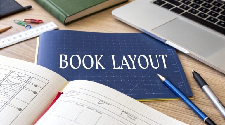
Understanding the Basics of Paperback Formatting
Before diving into design elements, it is important to understand the standard requirements for a paperback. Most book publishers have guidelines for page size, margin dimensions, and font choices. Choosing the right font is crucial for readability, and it is best to stick with classic serif or clean sans serif fonts for the main text. Chapter headings should stand out but remain consistent throughout the book, giving your readers a sense of structure.
Bookstore-Ready Paperback Formatting: Creating a Seamless Layout
Creating a seamless layout means guiding the reader through your story without distraction. Start by setting a clear hierarchy for headings and body text so each section feels intentional. Choose a readable font and stick with it for the main text. Use consistent margins and line spacing to create visual breathing room on every page. Place page numbers and headers in the same spot throughout the book. When you add a book illustration make sure it aligns with the text flow and does not create awkward breaks between paragraphs or chapters. Check widows and orphans by adjusting where chapters begin and end so single lines do not float alone at the top or bottom of a page. Keep paragraph length balanced so reading feels natural on standard paperback pages. Finally print a proof to review how the layout behaves in the real world. A printed pass often reveals alignment issues that a screen preview cannot show and fixes at this stage will help when you work with a book publisher or prepare to publish my book.
Proofing and Testing Your Format
Proofing and testing your format is the stage where your manuscript transforms from a digital file into a professional-looking book. Once your layout is complete, take time to review every page carefully. Start by checking for consistent font sizes, paragraph spacing, and alignment throughout the book. Pay close attention to elements like chapter titles, headers, and footers, ensuring they follow a uniform style. Print a physical proof copy because what looks perfect on a computer screen can appear very different on paper. You may notice that margins feel too tight or that text runs too close to the binding. Reading a printed copy also helps you catch small issues like misplaced punctuation, extra spaces, or uneven text flow that digital previews often hide.
If your book contains a book illustration, review how it appears on the page and confirm that the images are sharp and positioned correctly. It’s also wise to share a proof copy with a trusted reader who can provide fresh eyes and honest feedback. Testing your layout across different formats is equally important, especially if you are working with an ebook publisher in addition to preparing your paperback. Ensuring both versions are read smoothly shows professionalism and makes your story enjoyable in every form. Once the proof is flawless, you can confidently move forward and publish my book knowing your layout meets the standards of a professional book publisher.
In the end, bookstore-ready paperback formatting: the finishing touches make a significant difference. Ensure that all page numbers, headers, and footers are correctly placed. Double-check your chapter headings and book illustrations for consistency. Taking the time to perfect these details can make the difference between a book that feels amateur and one that feels professional. Once your formatting is complete, you can confidently move forward to publish my book and share your work with readers everywhere. A well-formatted paperback reflects your commitment to quality and helps your book leave a lasting impression.