Imagine walking into a bookstore or scrolling through a digital library. Your eyes instantly scan hundreds of titles, but only a few catch your attention. What makes you pause? It’s not the title alone. It’s the cover that speaks to you first. The colors, the typography, the composition, these visual elements tell a story before the reader even opens the first page. That’s the true power of great cover design and formatting. For authors dreaming of seeing their name on a book spine or an eBook thumbnail, understanding the importance of presentation is vital. The cover is your silent salesperson. It introduces your story, your message, and your brand in a single glance.
And beyond aesthetics, proper formatting ensures that your story looks as professional as it reads, whether printed on paper or displayed on a tablet screen. Many writers think storytelling ends once the final chapter is written. But in reality, publishing your book is a journey that continues long after the last word is typed. To stand out among countless titles, both design and structure must work hand in hand. Whether you are working with book publishers or managing an ebook publisher account yourself, mastering the art of cover design and formatting can make all the difference. Let’s explore how you can transform your manuscript into a polished, professional masterpiece that not only reads beautifully but also looks stunning inside and out.
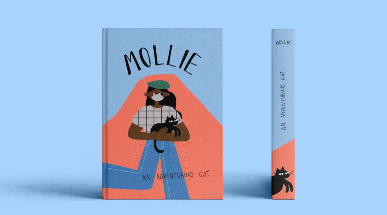
1. Cover Design and Formatting: Start with a Strong Visual Concept
Every great book cover begins with a story. Not just the story inside the book, but the one it visually represents. Think about the emotions and themes you want readers to feel. Is your story mysterious, romantic, adventurous, or inspirational? Use those emotions as a foundation for your design. The best covers are simple yet powerful. They capture attention without overwhelming the viewer. A well-chosen image, a unique illustration, or even a minimalist concept can do wonders. If you plan to include book illustration, ensure it reflects the tone of your writing and doesn’t clash with the overall message. Remember, readers often form opinions about a book in seconds, so your first impression must be unforgettable.
2. Understand the Basics of Typography
Fonts play a bigger role than most authors realize. Typography can define the entire mood of your cover. Serif fonts often give a classic or literary feel, while sans-serif fonts feel modern and clean. Cover design and formatting: Script fonts, on the other hand, work well for romance or personal memoirs when used sparingly. Make sure the title is readable even at thumbnail size, especially if you plan to publish your book digitally. Bold contrasts and legible spacing make your design look professional and well thought out. Avoid overcrowding the cover with too many font styles. Two complementary fonts are usually enough, one for the title and one for the author’s name or subtitle.
3. Color Choices that Speak Volumes
Color psychology is a crucial aspect of cover design and formatting. Each hue evokes specific emotions. Blue often conveys trust and calmness, red brings energy and passion, while gold or black suggests luxury and sophistication. Choose a color palette that matches your story’s tone and resonates with your target readers. When designing for print, make sure colors are in CMYK format to ensure accurate printing results. For digital books, use RGB for vibrant screen display. These small technical details might seem tedious, but they separate amateur designs from professional ones.
4. Maintain Consistency Between Print and Digital Versions
When you publish your book in both print and digital formats, consistency becomes essential. The layout, proportions, and visual hierarchy should complement each other, even if slight adjustments are necessary. Digital covers may need simplified designs because of smaller display sizes, while printed ones allow for more intricate details and textures. Formatting plays a key role here too. Print books require attention to margins, page size, and bleed lines, while eBooks demand responsive text that adapts to various screen sizes. Both versions should reflect the same brand identity so readers can recognize your work across platforms.
5. Focus on Professional Formatting Inside the Book
A beautifully designed cover attracts readers, but consistent formatting keeps them engaged. Inside the book, ensure that fonts, spacing, and alignment are uniform throughout. Use clear headings, readable chapter titles, and proper indentation. Many new authors overlook this step and rush to publish, only to realize later that their text alignment or spacing looks inconsistent on different devices. Professional formatting also prevents awkward page breaks, missing sections, and uneven margins. If this feels overwhelming, hiring a professional formatter can save you time and help you achieve a polished final product.
6. Collaborate with Experts When Needed
Even the most talented writers can benefit from expert collaboration. A professional designer understands how to balance creativity with market trends. Book publishers often emphasize that an attractive design increases visibility and sales potential. Likewise, an experienced ebook publisher knows how to optimize cover dimensions and file formats for online stores. Don’t hesitate to seek feedback. Sometimes an outside perspective reveals what you might miss as the author. A collaborative approach ensures your book meets both artistic and commercial standards.
7. Cover Design and Formatting: Test Before You Publish
Before you officially publish your book, test your cover on multiple devices and print samples. What looks sharp on a computer screen might appear dull in print, and vice versa. Ask for opinions from readers or fellow authors. Gather honest feedback about the first impression your cover gives. Also, review the interior formatting on different devices such as tablets, smartphones, and eReaders. A smooth reading experience boosts professionalism and reader satisfaction.
In the end, perfecting cover design and formatting is both an art and a science. It requires creativity, attention to detail, and a deep understanding of how readers connect with visual storytelling. Whether you work with book publishers or choose an ebook publisher to handle your digital editions, your cover is your ambassador to the world. It tells your story before a single word is read. When your design reflects the heart of your book and your formatting enhances readability, your work becomes more than just another title on a shelf. It becomes an experience, a polished, professional, and captivating creation ready to inspire readers everywhere.