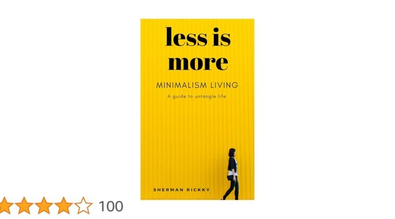
There is something quietly powerful about a minimalist cover. It does not scream for attention, yet it manages to draw the eye with subtle confidence. Think about the last time a book caught your attention, not because it was flashy but because it was simple and elegant. That feeling of curiosity and calm intrigue is exactly what minimalist design achieves. For authors and creators, this approach can feel intimidating. You might wonder how reducing elements or text could make an impact when so many are competing for attention. But the truth is that simplicity often carries the strongest message.
Writing minimalist covers: when less really is more: Minimalist covers invite the reader to pause, breathe, and connect with the story without overwhelming them with noise. It is about trusting that your words, your title, and your visuals will carry weight even without elaborate decoration. Many successful books have embraced this principle and found that letting go of clutter allows the essence of their story to shine. Minimalism is not about doing less because you have to. It is about doing less to communicate more effectively. When writing a minimalist cover, every choice matters. The font, the spacing, and the tiny details in a book illustration all contribute to a cohesive experience. The cover becomes a promise of what the reader can expect, and when done well, it creates curiosity and excitement.
Choosing the Right Elements
When designing a minimalist cover, the first step is careful selection. Ask yourself which elements are truly essential. A single striking image can replace a dozen small icons or illustrations. Colors should be deliberate, not decorative. Even the placement of the title can influence how the cover feels. A well-chosen book illustration can convey mood, genre, and tone without overwhelming the viewer. It is important to remember that restraint does not equal emptiness. Each component should have a purpose, communicating the essence of your story at a glance.
Writing Minimalist Covers: When Less Really Is More: The Role of Typography
Typography plays a significant role in minimalism. The typeface you choose becomes part of your narrative. Clean, readable fonts help convey sophistication and professionalism. The spacing, size, and alignment can create a sense of balance that makes your cover inviting. Unlike elaborate designs, minimalist covers rely on precision and intention. Every letter matters, and every word should feel intentional. Even subtle details like letter spacing or the weight of the font can influence the mood and tone of your cover.
This approach is especially beneficial when working with ebook publisher platforms where clarity is essential for small screens. Thoughtful typography ensures that your title stands out, communicates the right emotion, and complements the overall design without overwhelming it.
Emotional Connection Through Simplicity
A minimalist cover can create an emotional connection that is surprisingly deep. By avoiding clutter, you allow the reader to focus on the story’s promise rather than the design itself. This simplicity can evoke feelings of calm, curiosity, and elegance. A single carefully chosen book illustration or subtle design element can speak volumes, guiding the reader’s imagination without overwhelming it.
Readers often remember minimalist covers because they leave space for interpretation. The simplicity invites the mind to fill in the gaps, making the experience personal and memorable. It encourages curiosity, drawing the reader closer to the story inside. When done well, a minimalist design does more than look clean; it creates an emotional resonance that can linger, giving your book a quiet but powerful presence on the shelf or in an online store.
To sum up, mastering the art of writing minimalist covers: when less really is more
requires patience, thoughtfulness, and a willingness to let go of unnecessary details. When less really is more, the impact comes from clarity, focus, and intention. Every choice, from book illustration to typography, must serve the story. For anyone looking to publish my book in today’s competitive market, embracing minimalism can be a strategic and artistic choice. It allows your work to stand out not by shouting but by speaking softly with confidence. Minimalist covers may appear simple, but the thought and craft behind them can create lasting impressions that resonate with readers long after they close the book.